The visualization of data has emerged as a key scientific discipline in response to the increasing volume of information generated through computational processes. The discipline is divided into two branches: scientific visualization, which represents data derived from scientific experiments on physical processes, and information visualization, an extension of human-computer interaction designed to interpret and understand data through graphical representations.
Throughout history, particularly since the 18th century, there has been a growing interest in developing effective methods for visualizing information. The evolution of these techniques, as shown in the image below, has advanced significantly, constantly improving thanks to increasing technological sophistication.

Thanks to the technological advances of recent decades, the field of Visual Analytics has emerged, defined as the science of analytical reasoning supported by interactive visual interfaces. This innovative discipline merges visualization with data analytics, integrating elements from both information visualization and scientific visualization. Its main distinction lies in the use of a wide variety of techniques (such as 2D/3D graphics, geometric transformations, and hierarchical images) and visualization tools (such as tag clouds, motion charts, or dashboards).
Industry 4.0, digitization, and the transition to the “Smart Factory”
At the beginning of the 21st century, digitalization is in full swing, driven by trends such as the Internet of Things (IoT), Smart Cities, and Industry 4.0. This digital era has given rise to the massive generation of information and databases of all kinds. For this reason, technologies such as artificial intelligence and big data are emerging as powerful tools to extract value from this information. These technologies allow structured and unstructured data to be combined, offering unprecedented flexibility. This benefits sectors such as the physical and social sciences, finance, e-commerce, and industry, turning data into knowledge that improves decision-making and creates innovative customer experiences.
What are data visualization tools?
The data visualization tools are applications and software designed to transform complex information into intuitive easy-to-understand graphical representations. These tools allow users to create diagrams, charts, maps, and interactive dashboards that reveal patterns and trends within large datasets.
For a visualization tool to be effective, it must take into account the cognitive and perceptual properties of the human brain. Visualization enhances the clarity and appearance of the information presented, and its objectives include: identifying hidden patterns or anomalies, increasing flexibility in value searches, comparing data, and facilitating real-time human interaction.
Benefits of data visualization
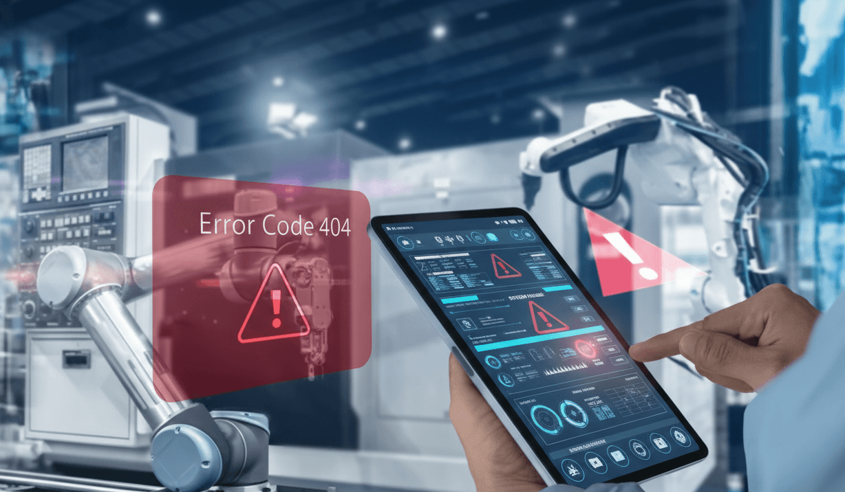
In the industrial sector, the incorporation of IoT sensors is optimizing data collection during production processes, from machine-level and production-line data to entire factory operations.
Data visualization can significantly improve efficiency, centralize monitoring, and provide real-time information for more agile decision-making. Among its key applications are:
Through self-service analytics, improving production, reducing production and material costs, identifying bottlenecks, anticipating stock shortages, and enhancing lean manufacturing processes.
By extracting and combining data from multiple sources (data blending), facilitating prediction and optimization of sales and operations planning.
Understanding customer demand by identifying what they are looking for.
IMMERSIA's Commitment to Innovation in Data Visualization
IMMERSIVE ANALYTICS
At IMMERSIA, we understand the need to apply advanced data visualization techniques in the era of Industry 4.0. With our extensive experience in this field, we have developed TOKII, a platform that not only integrates digital twins and emerging technologies but also stands out for its intuitive interfaces and visualizations designed to be cognitively effective.
With its advanced technologies, TOKII takes data visualization to a new level known as Immersive Analytics, a discipline that represents an evolution of Visual Analytics.
With our digital twin software TOKII, we ensure that companies can not only see their data but also interact with it in a more intuitive and efficient way. By combining virtual reality and other immersive technologies, TOKII turns data complexity into valuable information that drives real-time decision-making. For us, the key lies in enabling technology and imagination to work together, creating new ways of visualizing and processing data.